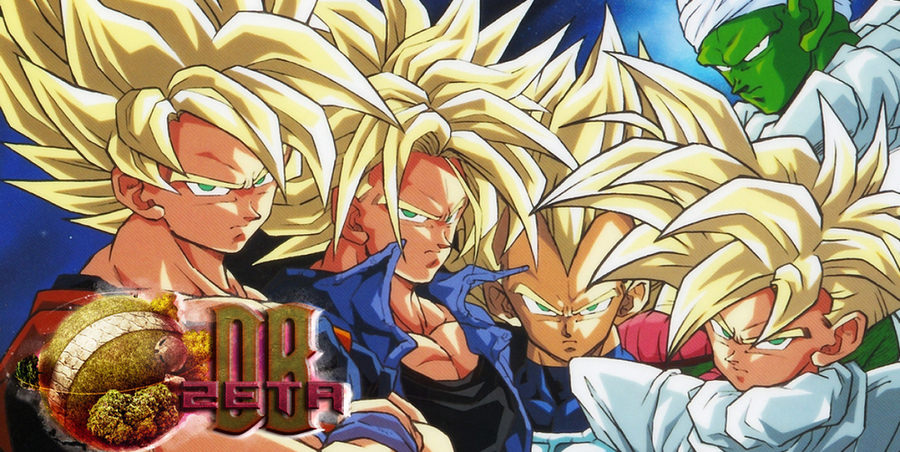
Favourite Art-Work(s)?

Warmmedown

Super Elite
Member
Joined
Jun 4, 2015
Messages
10,013
Age
31
???
4862149-v%20jump%20200503.jpg
looks like he's at a rave and took too much M

2nd one is cool. Even Goku looks good there
 

Fantastische Hure

Zeta Elite
25k
Joined
Jun 1, 2015
Messages
30,769
Age
29
???
4862031-v%20jump%20200407.jpg
4859869-v%20jump%20201506.jpg
5063785-v%20jump%20201604.jpg
5330953-v%20jump%20201608.jpg
6014895-10.jpg
Goku & random Yu-Gi-Oh! protagonist. Just posted for the absurdity of it lol.
6455811-201807.jpg
6807765-v%20jump%20201903.png
^Jump-Force promotional-cover from V-Jump

for wolf. i don't rly care for these covers I think. :cry :cry :cry
 

Warmmedown

Super Elite
Member
Joined
Jun 4, 2015
Messages
10,013
Age
31
naruto one looks cool, but is grainy/dotty

freeza/blue one is very cool, but not sure about the blue lines around vegeta/goku and why are they looking in the wrong direction (especially Goku). interedting font at the bottom ("dragon ball"). Reminds me of cheap toys, like knock off toys


3rd one with all the characters is v. cool. 10/10, except it looks bent. Guessing it's the combined front/back cover and spine of a book? Otherwise the way Hit's shoulder-chest line, goku's arm and whatever the hell that pink thing at the top is all line up is making it look that way, plus the text at the bottom maybe is too receding

Trunks and 2 Gokus is a cool idea, looks decent. Trading card adverts makes it look tacky.

next SUper one looks cool at first, but when you look closer the faces are dodged up. Like Cabba looks like a fish, Krillin looks like Nate Diaz with the mean mugging and I don't like Piccolo for some reason. Maybe because him and Gohan have the exact same expression (which I guess could be seen as a nice touch, due to their relationship). His skin tone is a bit different than in Z, not a fan. still a decent poster, 7.5/10. Also Toppo looks like one of those Unown pokemon lol, because of the thing above his head.

Goku and Yugioh one immediately looks super cool, more than any other ones so far. NOt sure about the melon coloured trousers on GOku. The other guy looks perfect. 9.5/10

Jump Force poster v cool. Luffy's eye is scary. WOuldnt have it in my room cuz of that. Also Yugi looks like a doll, which kinda messes it up a little.
 

Fantastische Hure

Zeta Elite
25k
Joined
Jun 1, 2015
Messages
30,769
Age
29
Jump-Force looks like clay lol.

And the reason the first one looks grainy is because the quality of the upload. It wasn't published grainy...obviously but with you you never know.

Also not a poster but a magazine-cover.
 

Fantastische Hure

Zeta Elite
25k
Joined
Jun 1, 2015
Messages
30,769
Age
29
???
5352802-1993.04.jpg
4859948-v%20jump%20199312.jpg
4859955-v%20jump%20199401.jpg
4859957-v%20jump%20199402.jpg
^If you can't already tell these are older V-Jump issues (like 1993 & 1994).
 

Warmmedown

Super Elite
Member
Joined
Jun 4, 2015
Messages
10,013
Age
31
nah. vhs aesthetic. or just like those things you put together and then iron to make art. i'm sure i've seen leaflets or other adverts like that.
 

Fantastische Hure

Zeta Elite
25k
Joined
Jun 1, 2015
Messages
30,769
Age
29
nah. vhs aesthetic. or just like those things you put together and then iron to make art. i'm sure i've seen leaflets or other adverts like that.
Then it was a good thing I told you (because your stupidity knows no bounds).

...jk...not...jk
 

Warmmedown

Super Elite
Member
Joined
Jun 4, 2015
Messages
10,013
Age
31
first one i was like holy sh&t that's cool, but GOhan is googly eyed. grainy, but in a good way

2nd one is cool. wall worthy

3rd one is different, can erally imagine gohan punching Cell right after. why's he looking at me instead of Cell though....uh oh....

4th one wtf, unique to see GOhan all battered like that, but he looks French for some reason.

I like the ones where they're not just in scenes from the anime more I think. Like I like the DB manga covers.
 

Fantastische Hure

Zeta Elite
25k
Joined
Jun 1, 2015
Messages
30,769
Age
29
The scenes sentence I agree with obviously, but at-least two out of four aren't scenes out of the series (the post you are talking about in your own post) in my opinion.
4859960-v%20jump%20199404.jpg
^this cover doesn't make sense to me. It was only two or so issues after the last one I posted but Gohan is seen on the cover with Freeza. Either Gohan's popularity in the Cell-Saga is the reason for that (even-though different incarnation any-way) or they were really serious about Gohan being the main-character now.
 

Warmmedown

Super Elite
Member
Joined
Jun 4, 2015
Messages
10,013
Age
31
did you post the one of Trunks on a cliff? That's one of my favourites. And this other one of Pikkoro and Goukuuuuuuu-sa has been one of my faves for almost a decade (8-9 years)? I found it on a kickass DBZ game song fuarrrrrrrrrrrrrrrrrrrrrrrrkkkkkkk listening to it now so good. I snipped the image from the YT video - not sure how to find a better quality version.
GokuPiccoloimagefromSuperButouden1YTvideo.jpg
 

Warmmedown

Super Elite
Member
Joined
Jun 4, 2015
Messages
10,013
Age
31
i really like the goku/bulma with the gun/dragon one, the one with the DB charas/kid krillin in a suit, the first one and the gohan one with the horizontal images of him in the background and the Son family one with Chichi driving. love the colour palette used for those DB "what-if" style covers
 
Top